Gone are the days of text-heavy, unorganized websites with little to no visuals, confusing navigation, and hard to read fonts.
Building user-friendly, clean, and beautiful websites aren’t just for top brands or graphic designers; these days, businesses from restaurants to realtors and newspapers to nonprofits are taking advantage of this trend to tell their story.
Traditional Media Catches Up With the Times
As print subscriptions continue to drop, publications are hiring design teams to come up with the best format for their mix of breaking news, long-form journalism, audio and visual media, and community building.
Three major news outlets have redesigned their websites in the last several months, after comprehensive user surveying, internal testing, and analyzing massive amounts of data.
Here are some of the changes from each, with takeaways for nonprofits looking to enhance their online presence and keep up with the times:
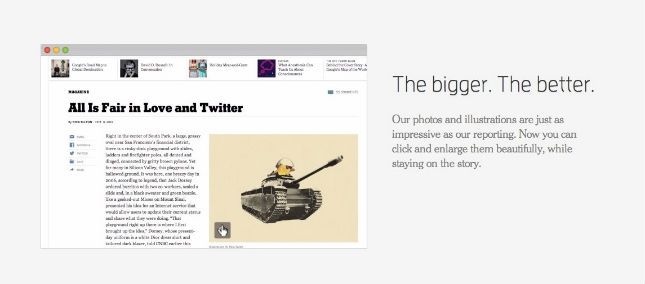
New York Times: NYTimes.com
Focus: “Designed with you in mind.”
New features and updates:
- Responsive interface so that it is optimized for any device
- An entire article on one scrolling page rather than split on multiple pages
- Richer storytelling with more photo and video-based interactive content (Ex. check out Snowfall, and Extra Virgin Suicide)
- Cleaner fonts, more white space
Takeaways for nonprofits:
- Interactive, visual storytelling is key: try it for both longer-termed campaigns with multiple elements, or for a short story or update from your team, or to recap an event.
- Strive to keep donation and signup forms or longer stories and blog posts to one page each, and you’ll see higher action and read rates.
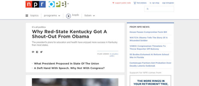
NPR: NPR.org
Focus: “We have more to tell you.”
New features and updates:
- More prominent member station connection and location targeting
- The uniqueness about stories highlighted cuts through “headline haze”
- Favorite programs and stories with enhanced audio and video
Takeaways for nonprofits:
- Look for ways to put a local spin on your content and actions for deeper connection to your community, i.e. a searchable list of volunteer activities, partner orgs, or hometown advocates and champions.
- Be inspired by NPR’s integration of radio and web and think strategically about cross-channel storytelling. Ex: Photo story accompanied by a podcast, or a video that links to an eBook download.
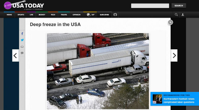
USA Today: USAToday.com
Focus: “To take visual storytelling to the next level.”
New features and updates:
- Redesigned print and web for stronger visuals and voices
- Enhanced user control and customization for reading style
- Flip horizontally through articles and sections (inspiration from tablets)
Takeaways for nonprofits:
- Use layers of content through color, layout, and functionality to drive the narrative. Ex: Campaigns house a slideshow format blog/story for an introduction, a video gives a behind the scenes look, and infographics are always in the blue box in the right margin of a campaign page.
- Study how your supporters consume content when creating new elements for your website. What’s on-trend (mobile) may not suit your audience. Perhaps they still prefer more text and less video. Or maybe they get all of their information from Twitter. Do your homework.
Let’s take a step back…
The Big Picture
Just as newspapers are taking a cue from their magazine counterparts, nonprofits can follow the lead of those in the business of telling a good story.
As with any major design changes, it’s important to do audience testing to ensure your updates are in line with what your community wants and how they interact with your mission.
Editor's Picks
Ultimate Guide To Peer-to-Peer Fundraising
Customer Story: Spur Local Raises Over $1M With Their Give Local Campaign
Fundraising Strategies for Nonprofits: Craft the Best Approach for Your Organization
Create a Killer Fundraising Plan - Best Practices, Strategies, & Downloadable Template