Optimize. We hear that word a lot nowadays.
As nonprofit professionals, we are told to optimize our websites, our newsletters, and our emails. But what does this really mean? And (more importantly) what does this add to your plate of a million and one things to do? Who actually has time to “optimize”?
Don’t worry. I’ve got you covered.
To optimize simply means to make more efficient and effective. When you optimize your nonprofit’s online resources, you’re rearranging and altering them to be more user-friendly. Yes, it takes time and planning to optimize, but the results are usually worthwhile for your organization.
All this brings us to your nonprofit’s donation page—a tool you should use to collect everything from everyday donations to funds from special campaign initiatives. Ask yourself: Is my donation page effective? Can donors access it easily and go through the financial transaction without added effort?
If you answered “no” to either of these questions, it’s time to optimize your donation page.
Here’s why and how to do it right.
3 Reasons to Optimize Your Donation Page
Donation pages are designed to be the ultimate tool to help your nonprofit collect donations anytime, anywhere, at your donor’s convenience. Thankfully, optimization helps ensure convenience.
1. Users are Giving Online
Just a decade ago, if you asked the average fundraiser where he/she connected with donors, the answer would most likely be “in person” or through the mail. Yet, that’s not the case today. In fact, online giving is an ever-increasing trend!
Your donors are online, browsing Facebook, reading emails, and visiting websites. Whether they just so happen to stumble across your donation page through a link or go there intentionally, you want to make sure it’s easy for them.
2. But They’re Not Always Using a Computer
Naturally, mobile giving is increasing alongside mobile device usage. In fact, mobile giving has increased by 80% since 2013—and that’s a trend that’s expected to continue into the future.
You can’t bet on your donors accessing your donation page from their computer anymore, which means it should be optimized for many different devices of varying screen sizes. To ensure you’re optimized for mobile across the board, check out this mobile giving fundraising checklist.
3. And Accessibility = Happy Donors
Donors notice when things go wrong during the process of their transaction and one bad experience is bound to put a bad taste in their mouth. If your donation page isn’t easy and convenient for a donor, you’re going to struggle to keep them engaged long enough to follow through with the transaction.
Don’t make your donor work to give. Make it easy for them.
Accessibility, convenience, and optimization build trust and loyalty, creating a happy donor in the process.
How Do You Optimize Your Donation Page?
We built the case. Now, let’s get to work optimizing your donation page to meet the needs of both your organization AND your donor.
Limit Images
Depending on the type of device your donor is on and the speed of their internet, the images on your donation page can possible appear differently. To keep the distractions and potential problems at a minimum, limit the images you use
Remember, your donation page is just there to capture donations. Save your nonprofit story, moving images, and emotion-evoking videos for your website or other marketing materials.
Optimize Your Mobile
It’s always a good idea to optimize your donation page for mobile. Some donation pages, such as CauseVox Everyday Donation Pages, are already optimized for mobile. As a nonprofit user, you don’t have to perform any extra steps to ensure your page looks good to mobile viewers.
If you’re creating a donation page on your own, remember these common mobile optimization tips:
- Avoid pop-ups
- Design with average and above-average finger width in mind
- Minimize the number of redirects within the page
- Reduce the amount of text on your page
- Keep input fields on your donation form at a minimum
Make It Look Like Your Own, Even If It’s Not
An optimized donation page won’t confuse your donor. To minimize distractions and uncertainty, maintain the same colors and branding from your website on your donation page. Just adding your nonprofit logo makes a big, positive difference. So much so, that custom-branded donation pages nested inside a nonprofit’s website raise upwards of 6x more money.
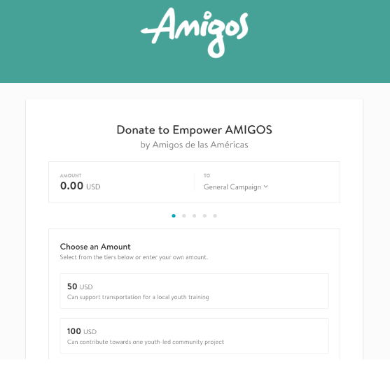
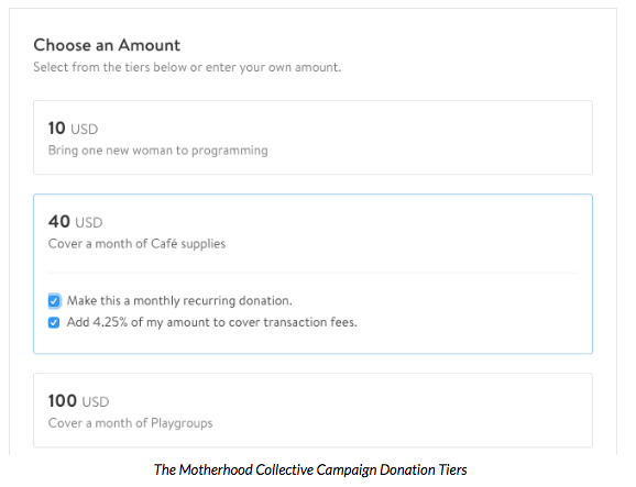
Give Your Donors Options
Optimization means ease. But if your donor doesn’t know what amount to give, you may lose them during the transaction. By giving your donor options, you’re helping facilitate the donation.
Here are two simple ways to give your donor options:
- Using donation tiers
- Adding a recurring/monthly giving option
Above All, Make It Simple
A clean layout without distractions ensures a positive experience and a processed donation. Save the lengthy stories and beautiful imagery for other places and instead, keep your donation page remarkably simple.
Donation pages are one of the best ways to collect donations in a central location. But a messy, chaotic donation page isn’t going to convert your online audience into donors. Remember, optimization is as important on your donation page as it is on your own website.
CauseVox Everyday Donation Pages are designed with optimization in mind. Create your free CauseVox account to set up your donation page in a matter of minutes and get to work collecting those much-needed donations.