When you’re creating an online fundraising site, there’s a lot of tasks that may immediately come to mind: getting your fundraising goal up, writing your appeal, thinking through a promotion strategy.
But something that might not be at the top of your list is designing your site – you’ll just pick some colors to get it out of the way while you focus on more important tasks.
From viewing thousands of campaigns over the last couple of years, I’ve seen that fundraising site design is one of the most important, and yet overlooked, parts of creating a successful campaign site.
It can be easy to put all your time and energy into your settings or plan, but since 38% of people will stop engaging with a website if the content or layout is unattractive, your site design plays a huge role in engaging your donors with your campaign.
Moreover, your fundraising site’s design is an opportunity for you to create a site that furthers your brand, tells your story better, and even attracts donors.
From color choice to media, the decisions you make for your campaign site’s look and feel leave an impact on your donors and play a role in your campaign’s success.
Here’s some best practices for designing a fundraising site that will attract donors and set you up for success.
Choose The Right Colors
Custom-branded donation pages raise 6x more money than unbranded pages, so establishing your site’s brand on your fundraising site is essential to your campaign’s success.
And the first step to making your site look and feel in line with your branding is choosing the right colors. Reach out to your marketing team to get the HEX color codes your nonprofit has already approved, and use them to select the colors you use on your campaign site.
Since it’s not always easy to track down your hex color codes, as a quick tip try taking a screenshot of your website and run it through this tool that will give you the HEX color codes from the image.
By carrying over your brand colors from your website to your campaign site, you’re ensuring that your donors immediately recognize that your fundraising page is part of your organization, giving them a sense of familiarity and trust with your new campaign.
But you don’t want to just place your colors anywhere on the site and call it a day. Your color placement can help your site at the very least be aesthetically pleasing, while calling attention to the areas on your site that are most important for donors to interact with. I recommend:
- Using contrasting colors for the Header Background and the Stats Background (if one is lighter, make sure the other is darker.)
- Taking the brightest color and use it for your buttons and progress bar; the eyes of your site visitors will be immediately attracted to them.
- Considering using another color from your brand for your content headings and links.
Here’s an example of how World Bicycle Relief translated their colors from their website onto their campaign site:
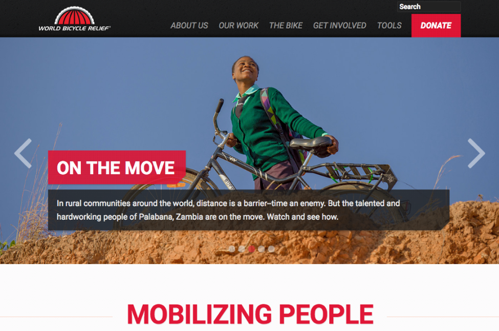
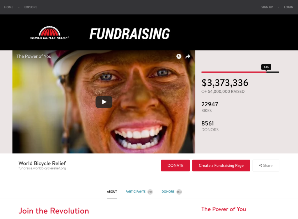
By carrying over their logo and colors, while the sites don’t look the same, anyone viewing these sites can tell they’re related. In this way, they ensure their visitors that the campaign site is just an extension of their own.
The colors of your site help your donors to recognize your brand and even helps communicate your message. If you’re just starting out and don’t have a color scheme selected yet, find a color scheme that best suits your organization and apply them to your site to begin establishing your brand.
Use A Single Logo With A Transparent Background
There’s more to establishing your brand than just color, however. Your logo is a key feature that ties your whole campaign’s look together and shows each donor right away who they’re donating to.
While it’s possible to upload a banner with plenty of pictures or text on your fundraising site, we recommend sticking with a single, centered logo at the top of your campaign site. For CauseVox users, this logo should not be more than 175 px H, but the width recommended sizing is more flexible depending on your logo design.
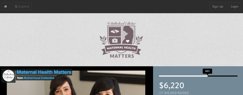
Moreover, to make your site even more professional looking and clean, we recommend using a logo with a transparent background, like the example in the photo below.
This allows you to freely choose the background color for your campaign, instead of trying to match the campaign background color to the logo background color or having an unsightly box around the logo that’s doesn’t match the background color on your campaign site.
Include A Video In Your Main Content Area
While guiding user after user on designing a fundraising site that sets them up for success, the campaign video is one part of a campaign’s design that’s easily tossed to the side in favor of a photo (which is a lot easier to create). However, campaign videos can be used to powerfully tell your story because if a picture says a thousand words, than a video says 10,000.
A campaign video gives you the opportunity to immerse your audience in your organization’s story with powerful images that show how funds are used, introduce a central theme and character, and help them emotionally connect with your cause in a way that they couldn’t otherwise.
Once your audience is emotionally invested, all the other information on your page comes into play- they care about your goal, your progress, and your appeal.
While I’ve certainly seen campaigns use a powerful image in their media section and meet their campaign goal, a video provides you the opportunity to bring it to the next level.
Here’s an example of a great campaign video:
While every campaign video is unique, here’s a few things that good campaign videos include:
- A central character to follow (although there can be other people in the video)
- A central conflict that the character encounters (usually with the issue your organization assists with)
- A picture of what life was like before and after your nonprofit intervened
- A picture of how funds are used
- A broader scope of the issue that shows how many people are affected, demonstrating need
- A call to action for people to get involved in solving the problem
Don’t know how to create a video? This is something that can be contracted out! Try posting on a site like Mandy or contacting a local university to get in touch with film students looking to build their portfolio, who can help you make a high quality video at a reasonable rate.
Use Images Throughout The Page
Putting a video at the top of your campaign is great, but that’s not where the media on your page should end.
Images that accompany your appeal can be powerful to engaging the audience in what you’re writing about. According to one study, posts that include images produce 650 percent higher engagement than text-only posts.
With higher engagement, your audience becomes increasingly invested in your campaign site’s content, which can ultimately help your potential donor make the decision to donate.
Here’s a few ideas of images you can include on your site:
- An infographic showcasing important statistics or how a process works
- Photos of your organization in action or of the people your organization helps
- Sponsor logos
- Create stylized text for headings
- Gifs of text or media that can further attract viewers on the campaign
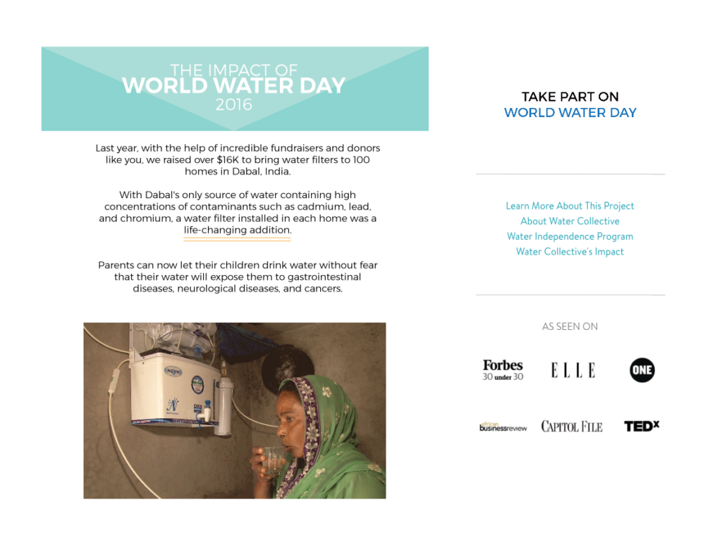
The Water Collective’s World Water Day campaign used logos for social proof, used plenty of gifs that show their filters in action, and the use of photos helped them to create stylized headings in line with their branding.
All this worked together to make their campaign easy to read and interesting to look at, while showing them how their funds would be used.
Ultimately, convincing someone to make a donation is an easier sell when they can see the impact right in front of them.
Looking to create some branded infographics or headings? Try using the free tool Canva, which you can use to easily create images without any photo editing experience necessary. Don’t forget to use your hex color codes!
Uploading all these photos and images to your site can take your campaign to the next level.
Your fundraising site’s design is too important to be an afterthought. Start brainstorming now about what photos, videos, or other content you need to gather for your next campaign, so your campaign has the branding and visually engaging content you need to attract donors.
Designing a fundraising site well really can make or break your campaign, and using these best practices, you can ensure your campaign is set up for success.