
It’s safe to say that the mass adoption of mobile devices, and smartphones, in particular, has changed the way we fundraise. But unlike some technologies that have come and gone in our lifetime (mp3 players, Discman, VHS tapes), mobile technology is here to stay.
Even now, mobile use is continuing to grow. In 2015, 64% of Americans owned a smartphone, compared to 35% in 2011.
As opposed to many other types of technologies which only touch on one aspect of our lives (music, movies, communication), you could say that mobile technology has fundamentally changed the way we operate on a daily basis because they do the job of multiple devices.
Try walking down the street today without bumping into someone whose nose is inches away from their smartphone screen. It’s not likely!
2014 was the first year that mobile usage was higher than PC usage. Since then, the gap has widened and sales of mobile devices outpace all other technologies.

One could argue that “going mobile” isn’t just trendy, it’s necessary. Many consumers believe a non-responsive website is an indication that a business or nonprofit simply doesn’t care about them.
Has your organization decided to take the leap and optimize your donor’s mobile fundraising experience?
If not, then make this a priority in the upcoming fiscal year. Incorporate the following ideas and tips into your plan, and then use the fundraising audit and mobile giving to ensure that you’ve covered all the bases for your upcoming campaign.
Reaching Your Donors On Mobile
Gone are the days when you pick up the phone and call your most loyal donors for another gift. Sure, this still happens, but many donors need multiple points of contact before they choose to give, and this includes electronic communications.
When crafting online communications, it is important to remember that people donate on mobile devices, not just their computers.
For the average nonprofit, 18% of donations come from mobile devices, but for some organizations (especially those with a younger donor base), it’s common for that average to be as high as almost 21%. You don’t want to miss out on this audience, so it’s up to you to make sure that you’re giving your donors an opportunity to give through mobile.
When your site is mobile optimized, it’s not just easier for people to give and read, it actually increases the chances of your nonprofit being seen. When someone does a Google search on a mobile device, Google won’t rank a page that provides a bad mobile experience. But if it’s optimized, it has a better shot at a higher ranking.
An optimized mobile giving experience for your donors should become part of a larger plan for capturing more donors and a wider audience. Here are some of the ways you can reach donors via mobile:
1. Social Media
As of April 2016, almost 80% of time spent on social media is done through a smartphone. If your organization is following nonprofit marketing best practices, then you’re likely on at least 2 social media platforms (i.e. Facebook, Twitter, LinkedIn, Instagram, Pinterest, Snapchat). The question is, are you using these platforms to your advantage?
Studies have shown that 55% of people that engage with a nonprofit through social media are inspired to take action. 59% of those respondents engaged with a monetary donation. The key is to provide relevant content that is engaging, shareable, and oftentimes includes a call to action. Just don’t post too often or too infrequently.
Take a look at this chart from HubSpot’s 2015 Social Media Benchmarks Report to see how your nonprofit’s social media strategy compares to others, and then adjust as necessary. If you find that you don’t post images as frequently as other nonprofits, it may be time to incorporate this into your social media content.

2. Email
Not only do people donate on mobile devices, but they do so because they receive an email that they read on a mobile device and they choose to donate at that moment. In fact, about 1 in 5 donors give as a result of an email they read on a mobile device.
But don’t just send out your normal email. Be sure that it is optimized for mobile. According to Constant Contact, 75% of email recipients said that they are highly likely to delete an email if they can’t read it on their smartphone.
3. Websites
Organizations often direct donors to their website from social media and email, and this is a great way to educate your donors and provide them with the tools they need to make an educated donation.
61% of consumers say that they have a more favorable opinion of brands that offer a good mobile experience. As well as providing a good experience to your donor, a mobile-friendly website may wind up validating your cause and legitimizing your organization.
4. Applications
According to Go-Globe, over 52% of the time spent on digital media and 89% of all time spent on mobile devices is through mobile applications. And while this is great for larger nonprofits with the resources, content, and following to support an entire application, small to medium-sized nonprofits shouldn’t create an app just to have one for donation purposes.
Weigh the pros and cons of creating an app for your organization, including cost, staff time, maintenance, and the anticipated return on investment. If the numbers don’t add up, try optimizing your website to mimic a mobile app.
Why You Should Optimize For Mobile Today
So, now that you understand how fast mobile technology is growing and how to reach your organization’s audience on their mobile devices. But you may be wondering why you should be focused on mobile optimization for fundraising today.
Here are a few reasons why there’s no time like the present to get started.
1. Your Donors Are Using Their Smartphones Right Now
Every day, adults spend an average of 3 hours and 8 minutes reading email, interacting with social media, and making decisions (such as which causes they will donate to) while on their mobile devices.
We use mobile phones to make talk to other, watch television, order food, connect on Facebook, share pictures, bank, etc. so it’s only natural that your organization connect with current and prospective donors where they are– on their phones.
The last thing you want is for your audience to see a broken or jumbled site that wasn’t meant to be seen on mobile and think less of your cause enough to question giving a donation.

2. It’s One Part Of The Overall Fundraising Plan
A great study by SocialBrite found that mobile fundraisers raised about 2.2 times more than traditional web fundraisers. They noted that as nonprofits begin to change to a mobile responsive layout, fundraising becomes easier.
That’s not to say that you should put all your eggs in the mobile fundraising basket. You’re always going to have donors that prefer a phone call or a direct mail letter, and you don’t want to lose these loyal givers with a sudden change.
Instead, look at mobile fundraising as one piece of the fundraising pie.
3. Mobile Will Give You Access To A Larger Audience
Optimizing for mobile isn’t just about giving your donors a good experience. There are many benefits for your nonprofit or cause as well.
One of the biggest perks that will come out of focusing on a donor’s mobile experience is access to a broader audience, including younger donors between the ages of 18 and 29, those with a lower socioeconomic status and lower education levels, and minorities. These are donor populations that aren’t often targeted with typical fundraising methods.
Mobile fundraising gives you access to groups of donors that wouldn’t necessarily know about your campaign otherwise.
4. Mobile Connections Are Instant
Optimizing for mobile giving also allows your organization to instantly connect with your donors through email and social media. This is especially great if you are running a peer-to-peer fundraising campaign with a quick turn-around time!
Is Your Fundraising Ready For Mobile?
Are you ready to connect with your donors and collect donations on mobile devices? See how you’re doing by grading your fundraising website, donation form, and emails mobile readiness.
1. Grade Your Website
How to perform this audit: Using a mobile smartphone, disconnected from wifi and using only your cellular internet connection, navigate to your website and answer the following questions. If “YES”, check the box.
Is your website responsive to your mobile device? Does it respond to the size of your browser or redirect you to the mobile version of your website?
Does your site pass the grunt test? Are you able to identify exactly what your organization does (and why that matters) within 5-10 seconds?
Can you navigate to various pages throughout your site with ease (i.e. About, Donate)?
Perform a speed test. Did you score over 80 on mobile speed and optimization?
Does the site, including layout, images, and content appear as you want it to (ie. no issues with resizing of images or missing/chopped off words)?
Are you able to click on your links with the tip of your index finger?
Are all images visible without zooming?
Do all videos play without issue?
Has your mobile content been simplified per best practices (small paragraphs, adequate white space, minimal links)?
8-9 checks: Your audience can view and navigate your website on a mobile device with little to no issue. Way to go!
6-7 checks: While there are some areas for improvement, your website can be viewed on most mobile devices. Focus on the best practices outlined below to create more user-friendly mobile website experience.
0-5 points: There’s no time like the present to better prepare your website for a mobile audience. Follow the best practices outlined below to get started or build a new fundraising site.
Example: MANNA Foodbank mobile site. Total points: 8/9 // This mobile site is ready for a mobile audience. However, it is missing a link to the desktop site on the mobile homepage.
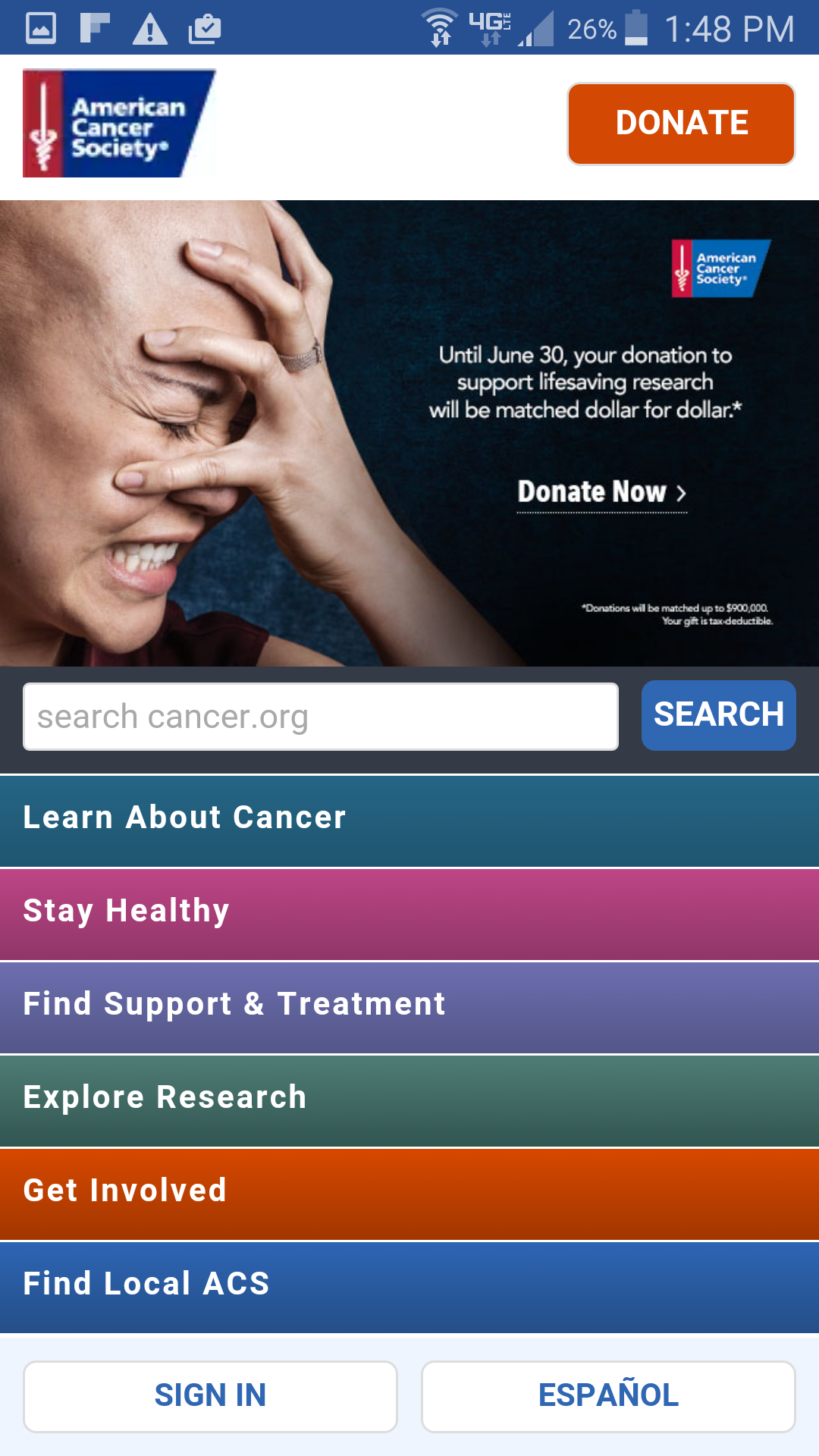
Example: American Cancer Society mobile site. Total points: 6/9 // This mobile site appears to follow most mobile website best practices. However, it does not pass Google’s speed test and many web pages feature images and content that aren’t optimized for mobile (too large, content not simplified).

Mobile Website Best Practices
- General: Don’t make the mistake of simply scaling down your desktop site to fit a mobile screen. It’s best to change your content to be more focused and simplified. This includes:
- One-click menus
- Less images
- Short forms that require less information. (ie. just name and email address as opposed to phone number, home address, etc.)
- Appearance: If your website appears funny, make sure that you set up a viewport tag (a code that makes the layout appealing to mobile users.)
- Sizing: If your links appear small or large, try setting them to 28×28 pixels.
- Images: If your images appear too small or large, size them to 57×57 pixels.
- Videos: Use this guide to create responsive videos if you use YouTube or Vimeo. If you host videos on another platform such as Wistia, Sprout Video, etc., check that particular site’s guide for responsive coding.
Keep in mind that nonprofits without the means to optimize the website themselves should look into outsourcing a web developer.
If you are interested in completing an additional website readiness audit, try using Google’s Mobile-Friendly Test tool.
2. Grade Your Donation Form
How to perform this audit: Head to your fundraising page on your website via your mobile/smart phone and attempt to make a donation and answer the following questions. If “YES”, check the box.
Does the page load within three seconds?
Is the page free of pop-ups?
Is the content viewable without zooming?
Does your phone auto-fill (or suggest to auto-fill) the donation form/donor information?
Does the payment information include all available options to the donor (credit, debit, PayPal, etc., as well as donation frequency)?
Does your mobile fundraising page include a simplified version of any optional information requested by your nonprofit (designations, communication preferences, etc.)
Does the donation go through?
Are you redirected to a confirmation response?
7-8 checks: Your audience is able to effectively make a donation through website on a mobile device.
6 checks: While there are some areas for improvement, donors can make a donation through on your mobile site. Focus on the best practices outlined below to create a more user-friendly mobile donation experience.
0-5 checks: Start following the best practices outlined below to optimize your donation page to receive donations on a mobile device. At this point, you may be missing out on donations. It’s time to prepare your site for mobile giving!
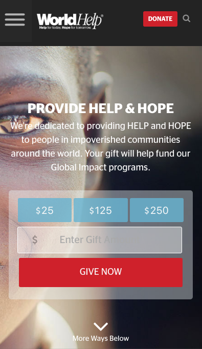
Example: World Help’s mobile donation page and form. Total checks: 8/8 // This donation form is optimized for mobile, making it easy for supporters to donate from any device.

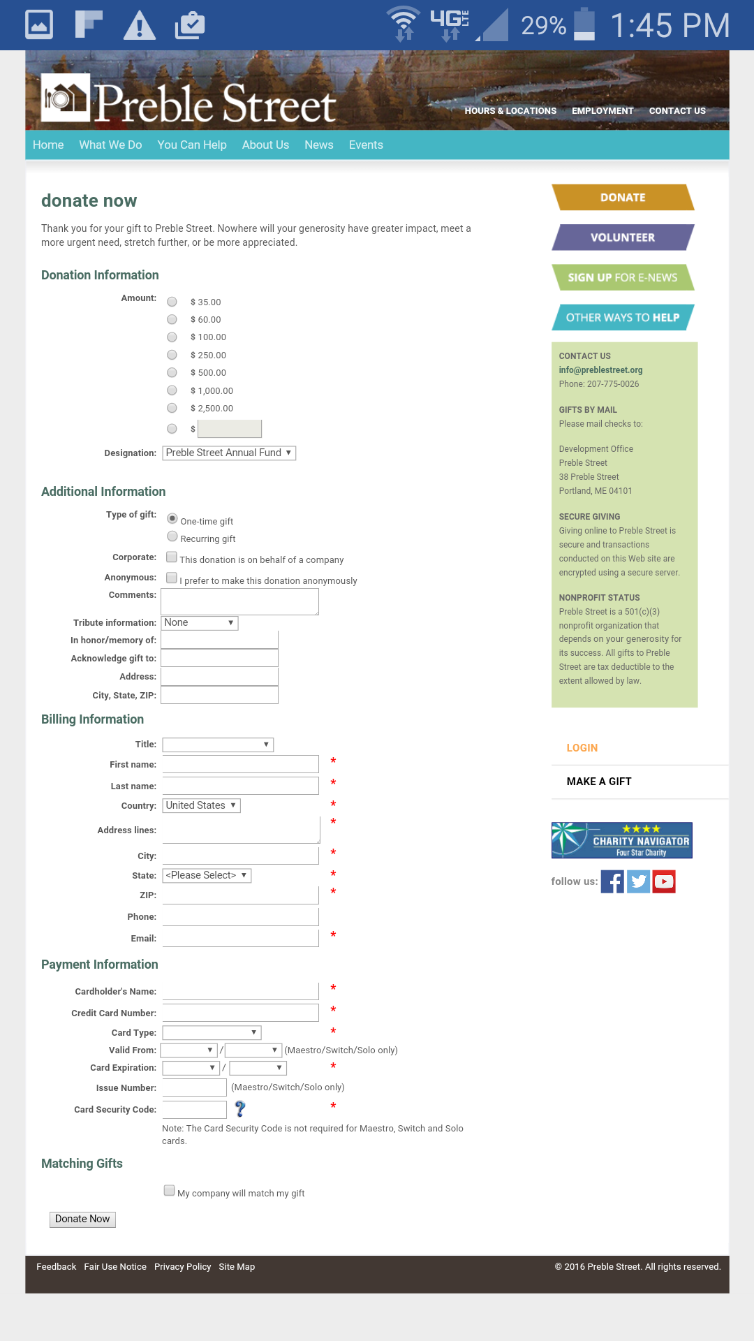
Example: Preble Street’s mobile donation page. Total checks: 3/8 // This donation page is not viewed comfortably on a mobile device without zooming in. Also, the requested donor information, including company match, tribute information, etc. is included but not simplified from the website’s version. While this page needs minor adjustments, donors can still make a gift.
Mobile Website Donation Best Practices
- Content: With mobile giving, it’s important to focus on simplicity. If possible, keep the donation form input fields to a minimum. Try to just focus on the information your nonprofit needs to process the donation (name, address, gift total, credit/payment information, etc.) and then follow up with your donor to collect more information down the road.
- AutoFill: Enable autofill on your forms to ensure a user-friendly experience. If you haven’t enabled this feature, check out this quick Google tutorial.
- Obstacles: Mobile users don’t like to encounter obstacles like popups, so avoid them at all costs.
- Layout/Design: Ideally, donors shouldn’t have to alter the page on their mobile phones to view the content. Be sure that you adjust sizing accordingly. While it isn’t necessary, a single column layout is ideal for all web pages, including the donation form.
3. Grade Your Fundraising Emails
How to perform this audit: Open the last fundraising email you sent to donors on your mobile device and answer the following questions. If “YES”, check the box.
Can you read the subject line in your list of emails?
Does the email, including images, load within three seconds?
Is there enough white space so that the email doesn’t appear cluttered?
Are you using a single-column layout?
Are the images proportional to the rest of the email?
Do your buttons fit the tip of your index finger without zooming?
Are all links large enough to click with your index finger?
Does the call to action stand out on the page? (ie. large button or bold color)
Is the content concise (between 2-4 paragraphs)?
8-9 checks: Your audience can view your fundraising emails with little to no issue. Your emails have incorporated many best practices for mobile optimization. Good job!
6-7 checks: While there are some areas for improvement, your emails can be viewed on most mobile devices. Focus on the best practices outlined below to create more user-friendly fundraising emails in the future.
0-5 checks: It’s time to take a serious look at your fundraising emails and start outlining ways to improve your mobile optimization immediately. Start by following the best practices below.
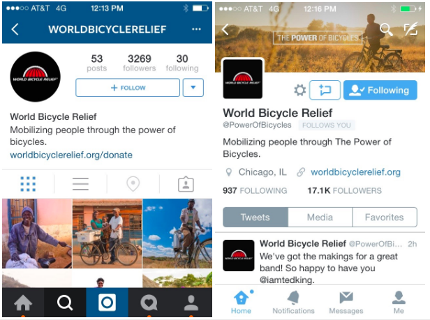
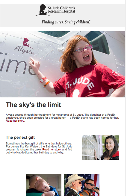
Fundraising Email Examples

Mobile Email Best Practices & Optimization Tips
- Responsive Email Template: If the email wasn’t easy to read, you may need to begin using a responsive email template to provide a good viewing experience across all platforms. Check out this site for 32 responsive email templates.
- Subject Line: Finding the right number of subject line characters takes practice. Keep in mind that the iPhone will only show 35-38 characters, while the Galaxy S4 shows 33 in portrait mode.
- Ideal Content: Emails with too many images or words are not ideal for mobile devices.
- Remedy your busy email by decreasing word count and limiting the email to 4 paragraphs or less.
- Use your image editor to add white space around images so that they don’t touch the edges or other words.
- Images: Set the height to “auto” and the width to between 50-80% for each image to ensure that the image appears proportional in your email
- If images do not load within three seconds, use a photo resizer.
“I just graded the mobile friendliness of my website! Find out your website’s mobile friendliness grade…” tweet this
Once you’ve taken these steps, head to the Email Marketing Guide For Nonprofits to learn more about how your nonprofit can create an effective email campaign.


