Data visualization is turning information into imagery, making it hard to digest statistics and numerical figures into easy to swallow pictorial figures. Consider data visualization as the intersection of quantitative analysis and storytelling.
Even if you didn’t know what exactly it was, you’ve already encountered data visualization. Anyone who spends any amount of time online these days will have noticed the bumper crop of infographics that get shared throughout social media.
Because metrics and storytelling are crucial to successful fundraising, using data visualization in your fundraising campaign is a great way to help boost donations. Images are easy to share and to take in, which helps spread the word about your campaign and your cause. The more people you reach, the greater the likelihood of meaningful engagement with your organization — financially and otherwise.
Here are a few ways to visualize data:
Graphs
If you have Microsoft Excel, then you already have the ability to create graphs that you could share as an image. If you’re measuring progress over time, you can use a line graph; for example, you want to show how many people your nonprofit has served over the years this way.
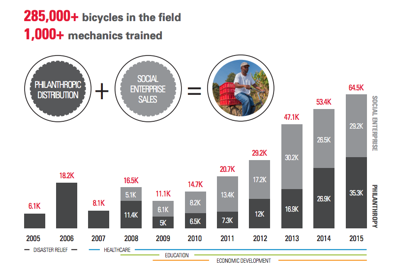
Or, you can use a graph to show how your organization will use a gift. World Bicycle Relief created the graph above to show not only how much impact has been made by their organization over the years which also shows how their funds are used. This example of data visualization is so effective because it shows conveys a high level of transparency and strategy.
Charts
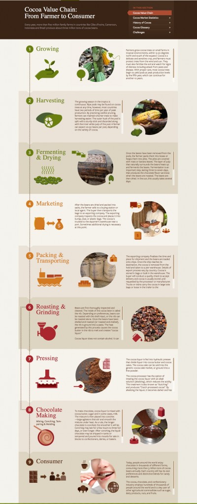
You could use a chart to visualize processes, the way the World Cocoa Foundation does in their process diagram of the Cocoa Value Chain (h/t Constructive). Use a chart to show the flow of money into impact and programs, or a pie chart to breakdown the allocation of funds.
Maps
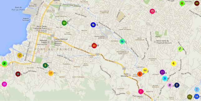
Map from Beyond Borders
Here’s one way your organization can show where the money goes. If you work overseas, maps show the locations and the extent of your impact, communicating more deeply than a mere verbal description and explanation.
By using maps to illustrate the extent of your reach, you bridge the gap between clients and donors. North America and Africa are quite far apart – especially in our minds – but something as simple as money can surpass geographic boundaries to change lives.
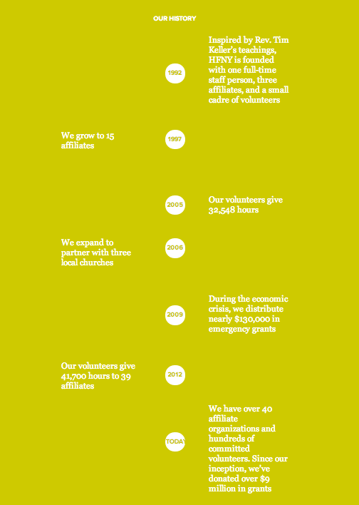
Timelines
Use timelines to illustrate the history of your organization or a particular project. This type of data visualization is effective if your goal is to convey chronology in a graphically compelling way. In a culture and society whose motto is “Carpe Diem!”, timelines remind us of the progress that has been made and serve to help cast hope for the future.
This kind of forward-thinking and vision-casting may be the encouragement supporters need to act. For example, Hope for New York’s website features a timeline that simply but elegantly tells the nonprofit’s story and progress in a way to invite seeing the possibilities.
Infographics
These are forms of data visualization that may combine other kinds of data visualization and/or simply present numbers and text in graphically compelling ways. Infographics generally serve an array of purposes, like providing instructions (“how-to”s) or comparing two things (“this vs. that”).

To illustrate global progress on achieving the United Nations Millennium Development Goals, GOOD and the Gates Foundation teamed up to create an infographic. At first glance, it looks like it’s just a map, but it also compares statistics on poverty, child health, and maternal health from 1993 and 2006.
A popular and effective way to display infographics is to animate them. For example, charity: water created a video for Earth Day 2011; it’s been viewed over 500,000 times and the nonprofit experienced an increase in online donations, per The Chronicle of Philanthropy.
Pictures speak a thousand words, but numbers can tell a story, too. Data visualization translates metrics & numbers into terms that even the most math-phobic person can understand.
Don’t worry if no one on your staff is a graphic designer, or if you’re hard-pressed to find volunteer graphic designers. Thanks to resources like Infogram and Visually, your organization can use data visualization to boost donations and to meet other needs. (And if you know of other data visualization and/or infographics tools, let us know in the comments!)
As a nonprofit, you’re constantly putting money where your mouth is. If you do well in showing where the money goes, you build the confidence and raise the trust your supporters need to keep investing in your mission.
Editor's Picks
Ultimate Guide To Peer-to-Peer Fundraising
Customer Story: Spur Local Raises Over $1M With Their Give Local Campaign
Fundraising Strategies for Nonprofits: Craft the Best Approach for Your Organization
Create a Killer Fundraising Plan - Best Practices, Strategies, & Downloadable Template